Case1. 売上を予測する
- データの理解
与えられたデータについて見ていき、現状把握や、需要に影響を及ぼす要因を探っていきます。
kaggle data description (データの説明)
- id : 店舗と日付を示すID
- Store : 店舗固有のID
- Sales : 任意の日の売上
- Customers : 特定の日の顧客数
- Open : 店舗が営業しているか(0:営業していない、1:営業している)
- StateHoliday : 休日(0:なし、a:祝日、b:イースター休日、c:クリスマス)。原則、休日は営業していない。
- SchoolHoliday : 公立学校の休みの影響を受けたかどうか
- StoreType : 店舗タイプ(a, b, c, d の4タイプ)
- Assortment : 分類?(a:基本、b:余分、c:延長)
- CompetitionDistance : 最寄の競合店までの距離
- CompetitionOpenSince : 最寄の競合店がオープンしたおおよその時期
- Promo : その日プロモーションしたかどうか
- Promo2 : 継続的なプロモーションを行っている店舗(0:していない、1:している)
- Promo2Since : 継続的なプロモーションを行い始めた年
- PromoInterval : 継続的なプロモーションが行われたタイミング
- DayOfWeek : 曜日(この項目の説明はdata descriptionにない)
ここからは、実際にデータを整理していきます(コード部分に興味のない人はコードは読み飛ばして頂いて結構です)。
参考:
https://www.kaggle.com/vaibhavlaturkar/retail-store-eda
https://www.kaggle.com/satyaprakash1986/r-randomforest
準備
# ライブラリの読み込み
library(data.table)
library(dplyr)
library(ggplot2)

# データの読み込み
train <- fread("./data/case01_train.csv", showProgress = FALSE, data.table = FALSE)
store <- fread("./data/case01_store.csv", showProgress = FALSE, data.table = FALSE)

# データの統合
train <- left_join(train, store, by = "Store")

# 営業していない日は売上がないので除外
train <- filter(train, Open == 1)
各店舗の1日あたりの売上
group_by(train, Store) %>%
  summarise(mean_sales = mean(Sales)) %>%
  ggplot(aes(mean_sales)) +
  geom_histogram() +
  labs(x = "mean sales per day", y = "stores")
## `stat_bin()` using `bins = 30`. Pick better value with `binwidth`.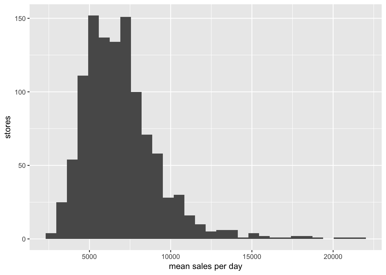
店舗ごとの1日あたりの売上の中央値は6,369ドル
特定の日の顧客数
各店舗の1日あたり顧客数
group_by(train, Store) %>%
  summarise(mean_customers = mean(Customers)) %>%
  ggplot(aes(mean_customers)) +
  geom_histogram() +
  labs(x = "mean customers per day", y = "stores")
## `stat_bin()` using `bins = 30`. Pick better value with `binwidth`.
店舗ごとの1日あたりの顧客数の中央値は609人
各店舗の売上と顧客数
group_by(train, Store) %>%
  summarise(mean_sales = mean(Sales),
            mean_customers = mean(Customers)) %>%
  ggplot(aes(x = mean_customers, y = mean_sales)) +
    geom_point(alpha = 0.6)
顧客数と売上には相関があります(店舗ごとの客単価に大きな違いはないことが推測できます)。ただし、売上を予測したい日の顧客数はあらかじめわからないので、予測モデルには使えません。
公立学校の休みの影響
group_by(train, Store, SchoolHoliday) %>%
  summarise(mean_sales = mean(Sales)) %>%
  ggplot(aes(x = mean_sales, fill = as.factor(SchoolHoliday))) +
    geom_histogram(alpha = 0.8)
## `stat_bin()` using `bins = 30`. Pick better value with `binwidth`.
店舗タイプ
group_by(train, Store, StoreType) %>%
  summarise(mean_sales = mean(Sales)) %>%
  ggplot(aes(x = StoreType, y = mean_sales)) +
    geom_boxplot()
店舗タイプbは他のタイプに比べ売上が多い。
分類?
group_by(train, Store, Assortment) %>%
  summarise(mean_sales = mean(Sales)) %>%
  ggplot(aes(x = Assortment, y = mean_sales)) +
    geom_boxplot()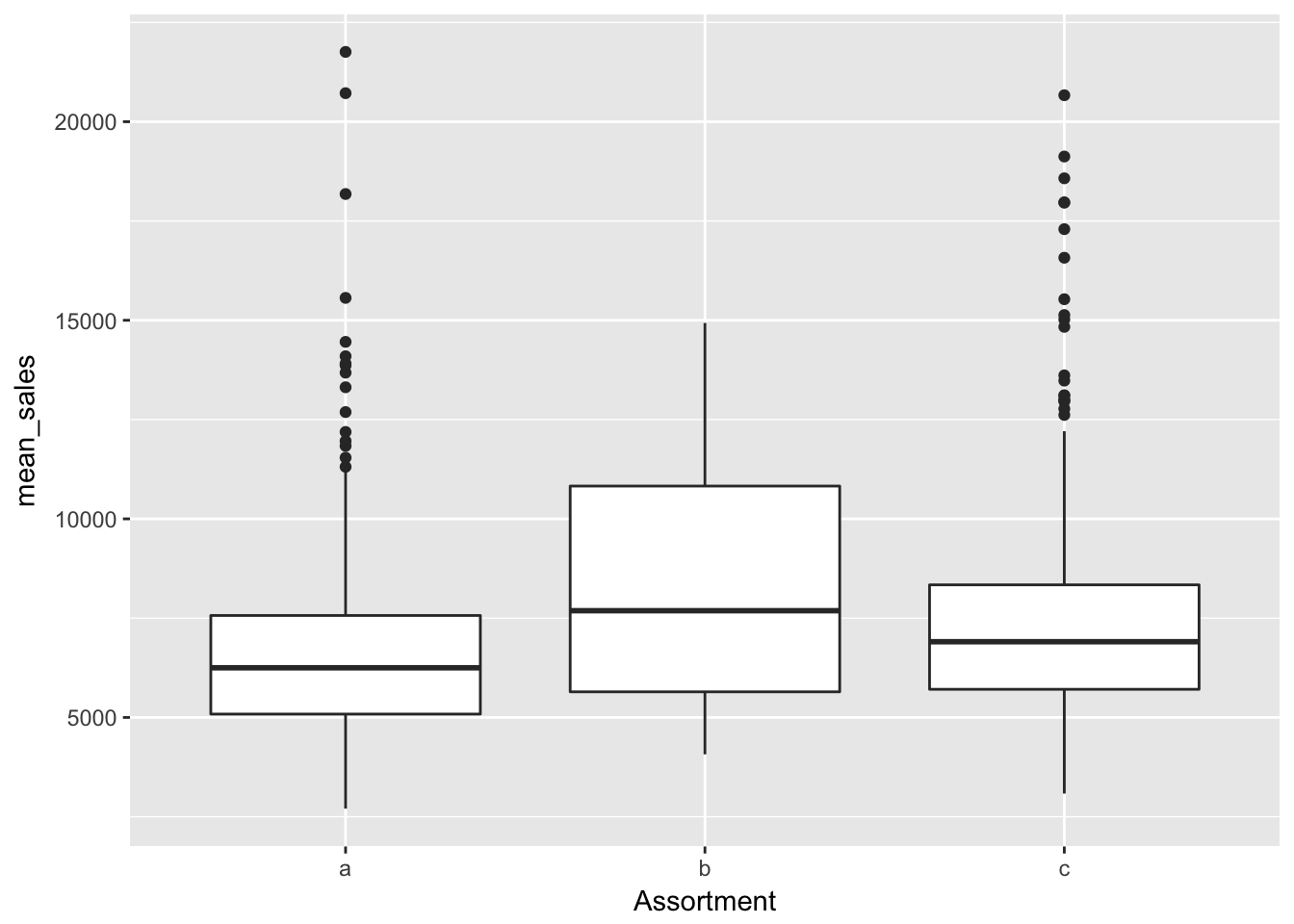
分類bは他のタイプに比べ売上が多い。
最寄の競合店までの距離
group_by(train, Store) %>%
  summarise(mean_sales = mean(Sales),
            competitionDistance = mean(CompetitionDistance)) %>%
  ggplot(aes(x = competitionDistance, y = mean_sales)) +
    geom_point(alpha = 0.6)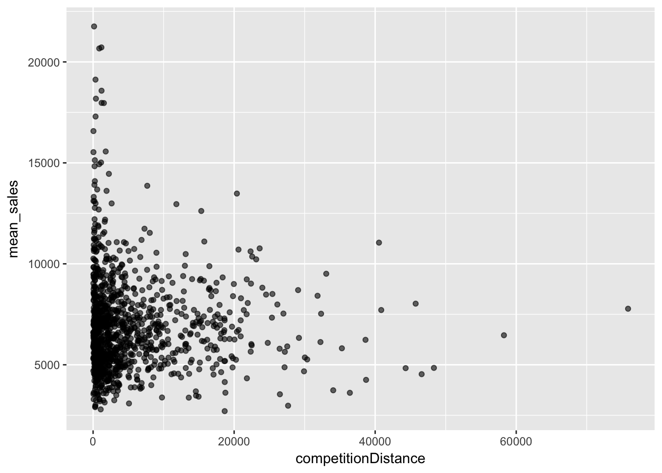
相関関係は見られないが、売上が高い店舗の周辺には競合店があることが見られるなど店舗の特徴を示す要因になっています。
プロモーションの有無
group_by(train, Promo) %>%
  summarise(mean_sales = mean(Sales)) %>%
  ggplot(aes(x = as.factor(Promo), y = mean_sales)) +
    geom_bar(stat = "identity")
プロモーションを行った日は売上が高くなる。
継続的なプロモーション
group_by(train, Store, Promo2) %>%
  summarise(mean_sales = mean(Sales)) %>%
  ggplot(aes(x = mean_sales, fill = as.factor(Promo2))) +
    geom_histogram(alpha = 0.8)
## `stat_bin()` using `bins = 30`. Pick better value with `binwidth`.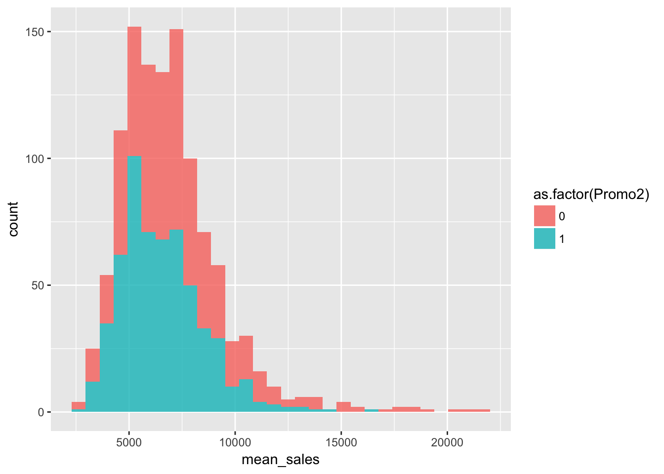
「継続的なプロモーションを行っている店舗」で売上と継続的なプロモーションに関係があまりなさそうなので、「継続的なプロモーションを行い始めた年」「継続的なプロモーションが行われたタイミング」は割愛します。
曜日
group_by(train, Store, DayOfWeek) %>%
  summarise(mean_sales = mean(Sales)) %>%
  ggplot(aes(x = as.factor(DayOfWeek), y = mean_sales)) +
    geom_boxplot()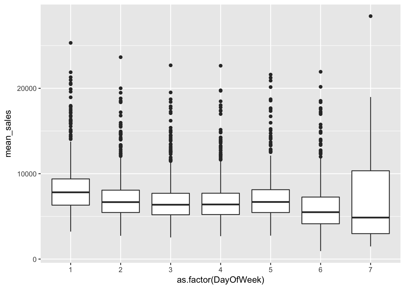
多くの店舗の売上が高くなる曜日(7)がある。
まとめ
- 店舗ごとの1日あたりの売上の中央値は6,369ドル、顧客数は609人
- 顧客数と売上には相関がある(店舗ごとの客単価に大きな違いはないことが推測できる)
- 店舗タイプb、分類bは他のタイプに比べ売上が多い
- プロモーションを行った日は売上が高くなる
- 多くの店舗の売上が高くなる曜日がある
- 「公立学校の休みの影響」「継続的なプロモーション」単体での影響はほとんど認められない